Thursday, April 30, 2009

Striking Out on Their Own

Following up on yesterday's discussion of the Brewers' inaugural season in the American Association, the 1902 Brewers wore uniforms identical to of the 1901 AL Brewers, save for the caps, leading me to believe that they may have purchased them directly from the departing club.

The Browns wouldn't have had much use for their navy blue socks or white and blue caps in St. Louis.  It wasn't like the Boston Braves keeping everything but their cap logo when they moved to Wisconsin, or the 1970 Milwaukee Brewers taking a seam ripper to the word "Pilots" on their uniforms.  The American League-founding Brewers changed their color scheme to match their new name:

So it's certainly possible that the first AA Brewers uniforms were recycled. But in any case, they would soon debut a new design, one which was all theirs:
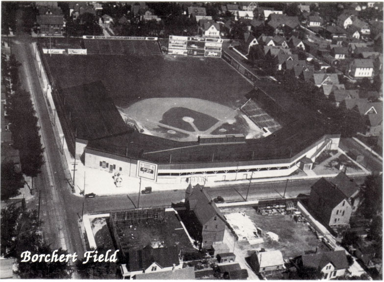
(Click to enlarge)

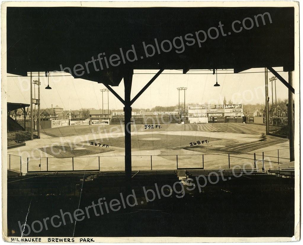
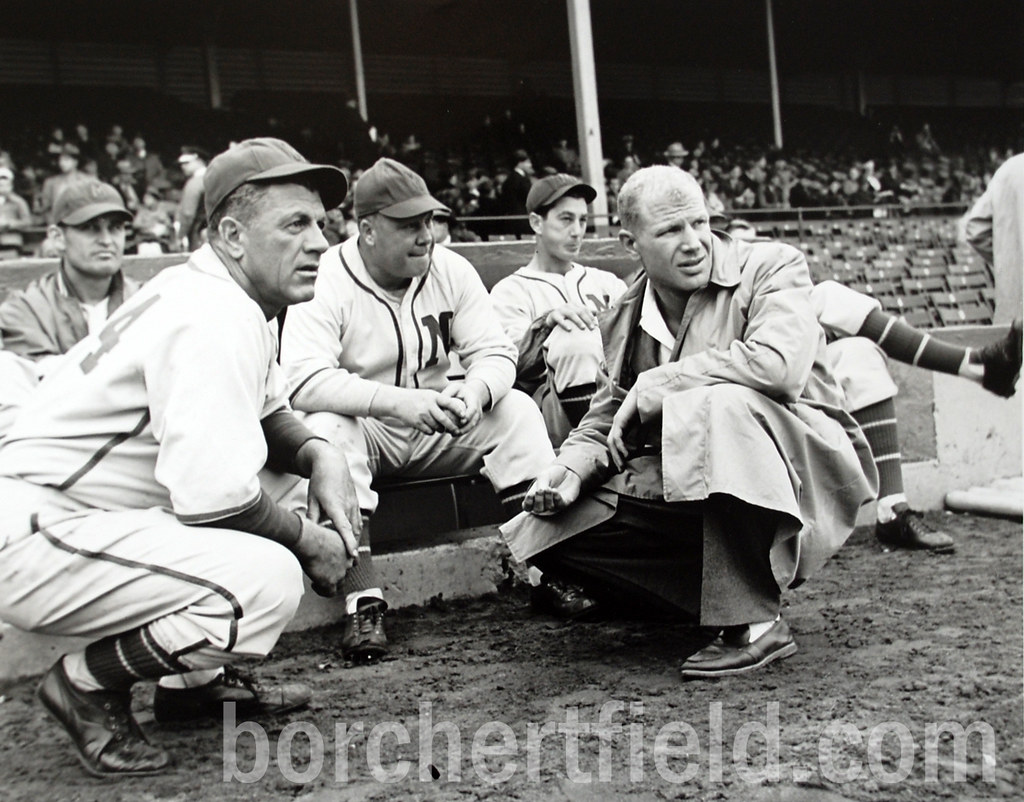
Guide: 1. Quait Bateman (1B/P), 2. Cliff Curtis (P), 3. Tom Doughery (P), 4. "Pongo Joe" Cantillion (Mgr), 5. Reeve McKay (P), 6. George Stone (RF/LF), 7. Frank Hemphill (OF), 8. Jack O'Brien (2B), 9. Harry Clark (3B), 10. Elmer "Spitball" Stricklett (P/1B), 11. Kid Speer (C), 12. Jack Slattery (C)

This team is identified in Brian A. Podoll's must-read book The Minor League Milwaukee Brewers, 1859-1952 as the 1903 Brewers, but if the player identifications are correct (and if Baseball-Reference.com can be believed) this is actually the 1904 club.

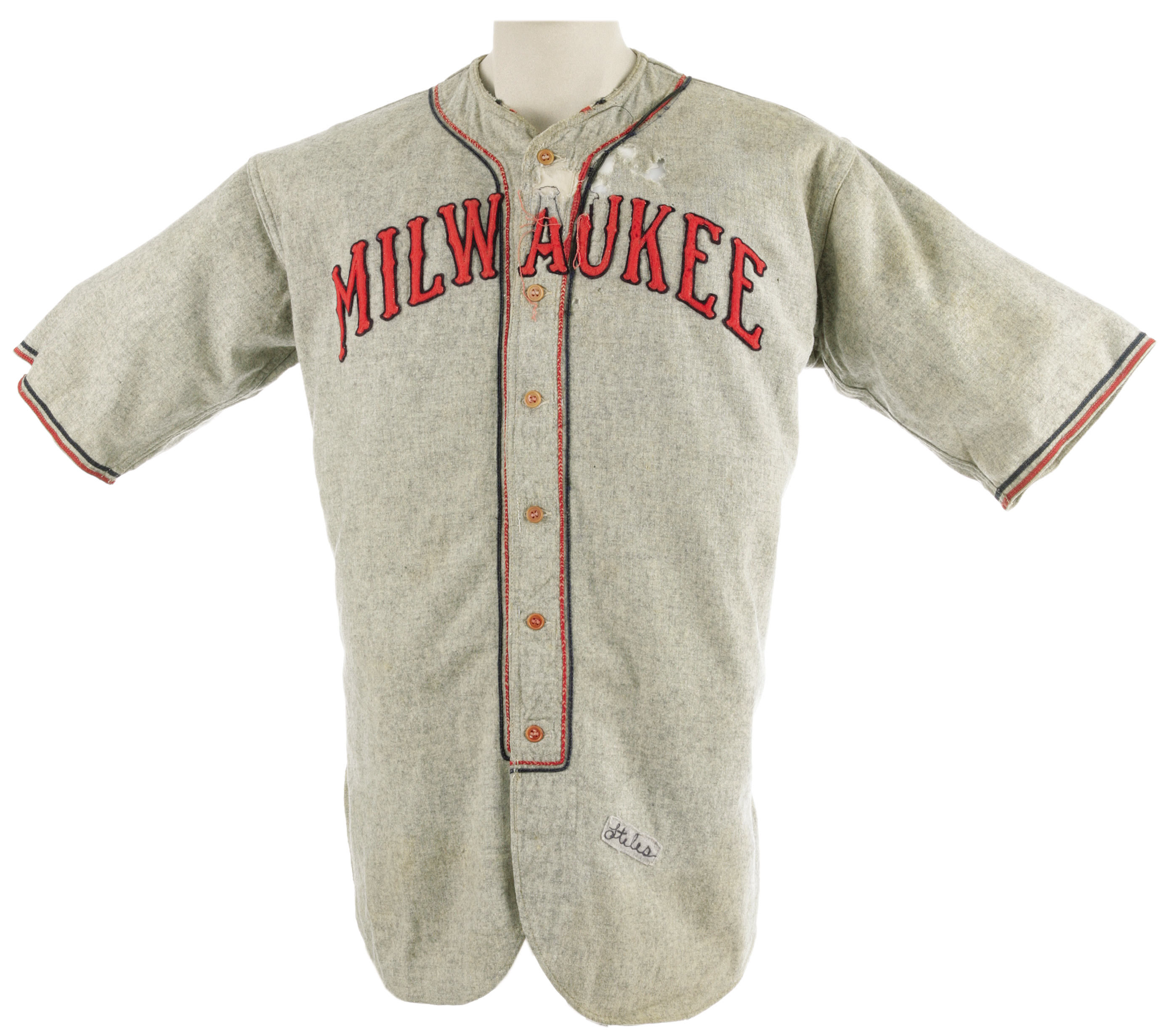
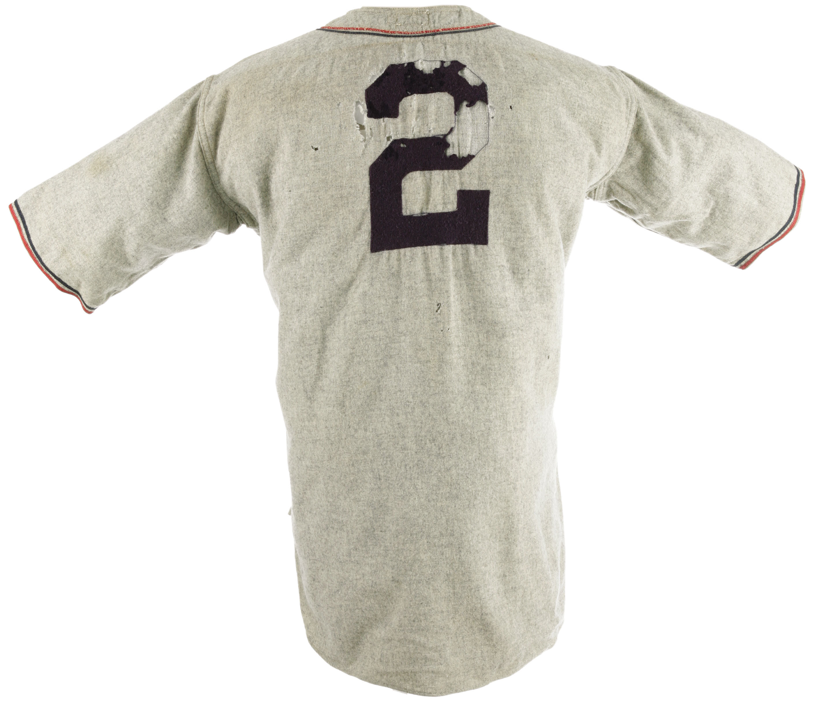
Regardless of the precise year (it could have been introduced in 1903), it's a beautiful jersey. After the standard block "MILWAUKEE" of the first uniform, an elegant, curvilinear script:

I'm presuming that the collar and script are navy blue, but that's entirely based on the relationship the Brews had with the color.  It sure looks darker than royal, but the Brewers didn't have a history of wearing black.

Gorgeous.  I'm really tempted to start saving up for another Ebbets Field Flannels custom order....

On the move

I went ahead and bought the domain name, so please update your bookmarks - the new address for this blog is http://www.borchertfield.com/.

I presume the old Blogspot address will still work, but you can use the more direct route to get here from now on.

Wednesday, April 29, 2009

In the Beginning

I picked up this photo a couple years ago, not entirely sure what team it represented. But heck, I love a good mystery.

I originally thought it could have been an early American Association Brewer team, one of the Western League clubs, or even the short-lived (1902-1903) Milwaukee Creams. I was right the first time - thanks to Rex Hamann (of the excellent American Association Almanac), we now know it to be the 1902 AA squad.

(click for larger image)

Another copy of the same photo was auctioned off by Lelands a couple years ago, and they tentatively identified it as from 1902 as well:
Sepia-toned 6 ½ x 4 ½” photo shows team portrait of the Milwaukee ball club from the outlaw baseball league, the American Association, who were once a legit major league team from 1882 to 1891, but, starting in 1902, the year this photo more than likely radiates from, began operating independently outside of the Major Leagues. Standout left-handed pitchers Nick Altrock, who would go onto the Majors (primarily as a Chicago White Sox and Washington Senator) after his brief stint with Milwaukee, and Eddie Plank, baseball's winningest lefthander pre-Spahn, figure most prominently in photo.

Let's do a little side-by-side. Click the comparisons to see original photos.

Looking at the photo, the man seated in the second row, second from the left is clearly a young Nick Altrock (seen here 20 years later).

Rex identified "the taller man in the back row" as Claude Elliott.

Second row, second from the right is Beany Jacobson:

Altrock and Jacobson spent one season in Milwaukee - 1902 (Elliot played two seasons in the Cream City, 1902 and 1903). I'm not sure which player Lelands thinks is Eddie Plank. I guess that could be Plank seated on the ground on the right - he seems to have the chin for it, although his nose and face appear too broad. Maybe they were looking at the man standing to the right of Elliott, who has the narrow face and prominent chin, but again he doesn't fit.

Nope, not really seeing it.

But more damning is the question: did Eddie Plank even play for the Brewers? I'm having a hard time digging up his minor league history, but in 1902 he pitched 36 games for Philadelphia (AL) - what would he be doing in Milwaukee? The more likely answer is that Lelands mis-identified the player. Still, we have enough to date the photo. Three confirmed players with limited time playing for the club give us a pretty conclusive date of 1902.

And there you have it. The photo represents the inaugural season of the American Association Milwaukee Brewers. Knowing this, I'm even more thrilled to have it in my collection.

Thanks again to Rex Hamann and Paul Tenpenny for all their help.

Next mystery - did the 1902 Brewers buy those uniforms from the recently-moved 1901 American League club, who wore the same mark across their chests?

Monday, April 27, 2009

Seeing Red (Smith)

Throughout the past century, it hasn't exactly been hard to find someone who is a fan of both the Milwaukee Brewers and the Green Bay Packers. It is considerably harder to find someone who wore the uniforms of both clubs. Richard Paul "Red" Smith was one of those men.

A native of the village of Brokaw in Northern Wisconsin, Smith went to Notre Dame, where he played football for Curly Lambeau's old coach Knute Rockne and captained the varsity baseball team.

After graduation, he signed with the New York Giants baseball club, playing in their minor league system. He got one game with the big club, in which he recorded a putout in the field but didn't get an official at-bat, before being sent back down to the minors.

After his stint with the Giants, Smith played five games for the Packers in 1927. He then took the field for the New York Football Giants in the first game of 1928 before being traded to the New York Football Yankees for the remainder of the season. He would continue to bouce around the NFL - in 1929 he suited up for another five games with the Big Blues from Green Bay, 1930 saw him with the Newark Tornadoes, and in 1931 he returned to the Giants, this time to play a full season. His playing days over, he coached football at Georgetown, Seton Hall and Wisconsin before returning to Green Bay as an assitant coach under Lambeau from 1935-43. He's seen here with Lambeau and Don Hutson:

Smith managed to keep one foot in the baseball world, coaching in the Brewers' farm system (yes, some of the larger independent minor league clubs had their own farm teams). He's seen here (center) in a Milwaukee Journal Brewers team photo from 1936, when he was coaching Milwaukee's affiliate in Fieldale, Virginia. Click for entire team photo:

Smith coached the Milwaukee Brewers themselves in 1939, 1940 1943 and 1944 before moving up to the Cubs with manager Charlie Grimm. Here he is (seated, center) with Grimm and owner Bill Veeck:


Okay, I have no idea what Red's doing here - what's with the outhouse structure at Borchert?

Smith returned to the Brewers with Charlie Grimm in 1951, serving as the team's business manager, and when Grimm was called up to lead the Braves managed the Brewers himself for part of the 1952 season. When the Braves moved west the following year, bumping the Brewers to Toledo, Smith went with them. He retired from baseball in 1955 and returned to his home in Wisconsin.


Smith died in 1978, but his name lives on in the annual Red Smith Sports Award Banquet, founded in 1965. It raises money for Wisconsin youth sports programs and scholarships.

Saturday, April 25, 2009

Borchert Field, home of the Packers

In the early 1930s, the Green Bay Packers decided to schedule some home games in Milwaukee. The Cream City had been without an NFL team since the Milwaukee Badgers folded in 1926, and the Bays (who were drawing an average of 3,000 to 5,000 fans for home games in Green Bay) saw an opportunity to increase their fanbase, not to mention their revenues. They may well have sought to pre-empt a new club from claiming Milwaukee as its own.

Whatever the reasons for the Packers' decision, the first venue chosen for their Milwaukee home was none other than Borchert's Orchard, the very home of those same Badgers:

Although the outcome of that particular game wasn't to Curly Lambeau's liking, the experiment was a rousing success - the 12,467 fans who packed Borchert on that Sunday was by far the Packers' largest home attendance of the season.

The Packers would go on to play home games in Milwaukee for the next sixty years, at Wisconsin State Fair Park, Marquette Stadium and County Stadium. Although they would never return to Borchert Field, the Orchard holds a place of honor in NFL history as the Packers' first Milwaukee home.

Wednesday, April 22, 2009

From the archives - Rollie Stiles 1932/34 jersey

This beautiful Brewers jersey came up for auction in October of 2007 (full disclosure: I bid on it at the time, but didn't win). Once again, auctions provide an excellent look at uniforms of the past.

Click for huge images:
The auction listing:

Lot: 19635 - Late 1930's Milwaukee Brewers Game Worn Uniform.

Duly proud of its sudsy claim to fame, Milwaukee has utilized the nickname "Brewers" for local ballclubs dating back to the turn of the century. Here we find a full uniform from the American Association farm club of the Cleveland Indians that bore the time-tested title, one of the earliest Brewers representations known. Red and blue felt spells "Milwaukee" in elegant block-lettered text across the chest, with a midnight navy number "2" taking up residence on verso. The jersey is tagged in the collar with "Wilson [size] 36" and local "Burghardt Athletic Goods" labels, as are the matching pants. An embroidered swatch affixed to the jersey's tail reads "Stiles," most likely the short-tenured St. Louis Browns pitcher of the early 1930's Rollie Stiles. Pants have similar swatch reading "Fieber" or something similar. A degree of damage to the jersey's chest and back must be noted, though it still displays quite nicely despite these flaws. When paired with the pants (which remain in fine condition) and the included two pairs of socks (though we believe only the red and navy pair matches), it will make an impressive sight. LOA from Lou Lampson.

Lampson's reputation has taken something of a beating in recent years. For what it's worth, I don't think the extra socks belong with this uniform either. The pants are another matter. The Burghardt tag (Burghardt is still around, incidentally) indicates that the Brewers may have worn them - I'll explore those in a separate post.

I'm wondering why they've dated this "Late 1930s", as based on the player these are certainly from the early 1930s, when the Brewers were not only affiliated with but owned outright by the St. Louis Browns. Stiles spent part of the 1932 and 1934 seasons with Milwaukee, so that fits with the tagging. Also not sure why they bothered to name-drop the Indians, other than there is presumably more interest in their collectibles than those of the Browns.

Personally, I really like the æsthetics of this jersey. Love the double-piping. And I'm always impressed when teams, especially minor-league teams, spring for a vertically arched wordmark instead of the cheaper radially arched version.

Saving up my money for the next time one of these surfaces....

Tuesday, April 21, 2009

Borchert Field Dimensions

Wedged into a single city block, Borchert Field had a very unusual layout. Looking somewhat like the Polo Grounds in Manhattan, the corners were cut off by Seventh and Eighth Streets, creating short porches to both right and left and long power alleys. Unlike the Polo Grounds, the outfield corners were devoid of seating - the bleachers were limited to one small section in center field, and anything hit with a little power down either baseline would land in the middle of a street.

In my collection, I have this 1940s press photo, given out as part of a pack of all American Association ballparks to radio announcers, which gives us the basic field layout:

(Click to enlarge - huge)

It lists the dimensions as 267 feet down the left field line, 268 down the right field line and 392 feet to straight away center.

On this thread on Baseball Fever, user "Pelt" created worked out the rest of the layout in sketchup:


He calculated a distance of 435 feet to each of the corners, "with only a couple of inches difference between the two".

That's an awful lot of real estate for an outfielder to cover.

Sunday, April 19, 2009

Now batting for the Brewers... Jim Thorpe?

There have been many legends to don the flannel of Milwaukee. Although not remembered as such today, among them was the storied hero (and later goat) of the 1912 Olympic Games, Jim Thorpe.

Thorpe, a multi-sport athlete dubbed "the greatest athlete in the world" by King Gustav V of Sweden as he presented Thorpe with a gold medal, dominated football, baseball and track and field. He would be stripped of his Olympic records and medals when it was discovered that he had previously played some professional baseball, forever losing his amateur status. It was common for college athletes to play pro ball at that time, but unlike Thorpe, most competed under pseudonyms (as did Pro Football Hall of Famer John McNally when he took the field for the Green Bay Packers as "Johnny Blood").

After the Olympic controversy, Thorpe returned to baseball, sporadically playing for the New York Giants from 1913 through 1915. He spent the 1916 season in Milwaukee, the only good player on a terrible, terrible club. The Brewers lost 100 games that season (the first Milwaukee club in any league to do so), finishing dead last, 18½ games out of seventh place.

Although he only batted .274 (with 10 home runs and 85 RBI), Thorpe did his part to keep his team out of the cellar, leading the league with 48 stolen bases. His efforts were noticed, as recounted here in this highlight from Janesville Daily Gazette sports page of July 10, 1916:

The caption mentions that Thorpe's time in Milwaukee was already drawing interest from the majors:

After returning to the majors with the Giants in 1917, he would indeed be sold to Cincinnati early in the season (he would go back to New York later in the year). Thorpe played organized baseball until 1922, all the while playing professional football for the Canton Bulldogs in the off-season (the Green Bay Press-Gazette selected him to the first official All-NFL team in 1923).

Today, he is remembered mostly for the Olympic scandal and for his namesake town in Pennsylvania, which he had never visited. But Jim Thorpe deserves to also be remembered for his contribution, if only a brief one, to the legacy of the Milwaukee Brewers.

Friday, April 17, 2009

Paging Mr. Attanasio....

Response to my idea of adding the Beer Barrel Man to the current Brewers uniform has been overwhelmingly positive.

At the risk of turning this into a National League Brewers blog, I'd like to post another uniform concept for the big league club. Caveat: I've never been a very big fan of the current Brewers' scheme - it's too sterile, too ad-agency-design, and is completely divorced from the city's long baseball tradition. I'd love to see them overhaul their look.

Here's my proposal to give the current bearers of the name the unique and modern look they deserve, while at the same time honoring the whole of Milwaukee's baseball history, including (and especially) the American Association Brewers.

The details, in no particular order:

Sleeve patch
For me, it all starts with bringing back the one, the original, the Beer Barrel Man. Symbol of Milwaukee baseball since at least 1901. Time he finally made the sleeves.

Wordmarks
The script font on the home jersey is Saloonkeeper, based on the script used by Leinenkugel's. It's surprisingly similar to the script used by the Brewers in the 1940s. The road wordmark is based on a 1930s Pabst Blue Ribbon label - I'm terribly fond of that one.

Colors
The color scheme utilizes the blue and gold influenced by the current colors (the only thing I really flat-out love about the current scheme). I've moved the home uniform to a light cream to reflect Milwaukee's nickname as The Cream City, as well as the various historical baseball teams known as the "Creams" and "Cream Citys".

Accent Striping
I included the shoulder piping not only because it has an historical precedent, but would also create a pattern currently unique in the majors. Another way to instantly identify the team. The Brewers used a similar thick piping from 1996-1999, and it looked great.

Number font
The numbers are what I call a simple square block. Again, they could be as easily identifiable as the San Francisco Giants' numbers are, without either drawing too much attention or sacrificing legibility. FWIW, I'm basing these on a number font worn by the Packers in the 1940s.

The cap logo
Well, I've always wanted to use a bottlecap in a Brewers concept. And the block "M" on the bottlecap clearly references the Milwaukee Braves and the American Association club.... okay, maybe I'm officially overthinking this one.

So there you go. Heavily influenced by the past while being (I hope) distinctive and modern enough to work today.

Thursday, April 16, 2009

Home of the Brewers

From 1902 through 1952, the entirety of their existence, the Brewers made their home at Borchert Field. Bounded by North 7th and 8th Streets, and Chambers and Burleigh Streets in Milwaukee, the confines of the single block creating some very unusual field dimensions:


Originally known as Athletic Park, and known for the first few decades of the 20th Century as Brewer Park, it was renamed for team owner Otto Borchert following his death in 1927. Sportswriters referred to it as "Borchert's Orchard" and simply "The Orchard."


The original tenants were the Milwaukee Creams of the Western League. The Milwaukee franchise in the Western League would eventually be known as the Brewers, but by the time the Western League renamed itself the American League and declared itself the second major league, the Brewers had left Athletic Park for another Milwaukee baseball field, the Lloyd Street Grounds (on Lloyd Street, naturally, taking up the two blocks between North 16th and 18th Streets south of North Avenue). The American League Brewers would play only one season before moving to St. Louis, where they set the standard for futility as the Browns.

Filling the void was a new club in the minor league American Association, adopting the now-traditional Milwaukee Brewers name. They moved into Athletic Park and built a colorful 50-year tradition, a success which would ironically would pave the way for the return of the majors.


Milwaukee had been interested in luring a Major League team since at least the 1940s, and to that end built Milwaukee County Stadium on the site of Story Quarry (where Miller Park now stands). The magnificent new ballpark was completed in time for the 1953 season with a capacity of 36,000 and lots of room to expand should the city land a major league franchise. In the spring of 1953 the Brewers were prepared to move in, as seen in this 1952 postcard:


It was not to be. Just days before the start of the regular season, the Braves got permission from the National League to finally move to Milwaukee. The Brewers would never have a chance to play ball in their new park, moving instead to Toledo to replace the recently-departed Mud Hens, and a proud chapter in Milwaukee baseball history would come to a close.

Borchert Field would eventually be razed and the entire block is now taken up by Interstate 43:


View Larger Map

The neighborhood is still known, as the map indicates, by the ballpark's name. An historical marker was unveiled in August 2008 in Clinton Rose Park, a few blocks east of where the Orchard once stood.

Wednesday, April 15, 2009

Looking Mighty Brave

In 1946, the Brewers were purchased by the Boston Braves, ending their run as an independent club (with the exception of two seasons, 1934 and 1935, in which they were owned by the St. Louis Browns).

The Braves' influence on Milwaukee baseball was tremendous (and well-covered elsewhere) but the influence would be expressed in a particularly subtle fashion - on the uniforms.

The Brewers had worn blue and red for decades, but during the period in which the Braves owned the club their uniforms would come to resemble the parent club's look more and more.

A block "M" over the heart was the standard Brewers home jersey dating back to at least 1913, in both pinstripe form and with the piping seen here:

Starting in 1942 under Bill Veeck, the Brewers began wearing a second home jersey in rotation, with simple neck and cuff soutache and an elegant "Brewers" script across their chests:

After the Braves purchased the club, the modifications began. The soutache was replaced with the Braves' signature navy/red/navy piping on the cuffs and the placket. The red M on the caps was replaced by a white block M, the very same caps that the Milwaukee Braves would soon make famous:

Note the old cap on the batboy, front and center.

By the time this photo of Johnny Logan and Jack Dittmer was taken in 1952, the Brewers' last year of existence:

That wordmark made its debut on 1950's Opening Day. Note the style of "B" and the Greek "e" on the script, which originated in the Boston Braves wordmark. Even the "w" is just two Braves' "v"s run together:

Other than the actual team name itself, the only differences between these uniforms and those of the Boston Braves are the lack of tomahawk under the team name (replaced by a tail) and the lack of piping on the belt loops. That one is particularly interesting to me, as it was customary to send old major league uniforms as "hand-me-downs" to the minor league clubs. The Brewers had uniforms which were nearly identical to those of the Braves, but just different enough so they couldn't advantage of the cost-saving measure of recycling the big club's uniforms.

Thursday, April 9, 2009

Join the Movement

Based on my conversations with Paul Tenpenny, I'm more convinced than ever that the time is right to lobby the Brewers for a small uniform change, honoring Milwaukee's baseball heritage (as well as the National League team's past in particular):

And just for good measure we can put this wrong to right:

Come on, Mr. Attanasio. It's time.


UPDATE 04/13/09: Paul suggested that this might be a more realistic goal:
Even that would be a step in the right direction. The deadline for 2010 season changes is May 31st of this year, so we need to spread the word soon. Time to step up to the plate:


UPDATE 2/17/10:
Well, we're partway there....

Wednesday, April 8, 2009

Party Like it's 1999

The Beer Barrel Man (known in his original incarnation as "Owgust") has been a symbol of Milwaukee baseball for decades. But aside from a brief spell on team jackets in the 1940s, he never made the uniforms. Until 1999. Ironically, it would come on an occasion when the team was looking to the future, not the past.

On July 23, 1999, the Brewers and the Florida Marlins played a “Turn Ahead the Clock” game in Miami. For years, MLB had featured “Turn Back the Clock” games featuring old uniforms and concession prices. The 1999 season saw a reversal in this format, in which teams hypothesized their own future, with futuristic pullover uniforms (but not, hopefully, future concession prices). For most clubs, the future looked much like the present. The Brewers, however, postulated a future in which the Beer Barrel Man would be returned to a position of prominence:

This is the first instance of which I'm aware that the Beer Barrel Man had graced a Milwaukee uniform (he did make an appearance on the team's jackets in the 1940s).


Here's how the look appeared in the MLB Style Guide:


While the Jetsons jersey template isn't anything to applaud, it was great to see the BBM back again. I bought one of those caps at County Stadium back in the day, wish I could find another.

Tuesday, April 7, 2009

Mystery merchandise

Horrible thought - I really hope that the new Beer Barrel Man merchandise Brewers spokesman Tyler Barnes promised in the Journal Sentinel actually features, you know, the Beer Barrel Man.
I worry because a different version of the Beer Barrel Man has turned up in recent months, as the merchandise companies discover old graphics.

I don't know much about the graphic's origins. So far as I know, he first showed up on this water transfer Flex-Cote decal, circa 1970:

The same company made similar decals for other clubs as well:

Because the images are rather generic, I always presumed that it was a knock-off. They may have been authorized, though, judging from the Yankee logo. Anybody have any more background?

Wherever it came from, the image has gained greater currency in recent months. Fingers crossed - it would figure that after years of waiting for the Beer Barrel Man to be merchandised by the club, they would choose the wrong one.