At the risk of turning this into a National League Brewers blog, I'd like to post another uniform concept for the big league club. Caveat: I've never been a very big fan of the current Brewers' scheme - it's too sterile, too ad-agency-design, and is completely divorced from the city's long baseball tradition. I'd love to see them overhaul their look.
Here's my proposal to give the current bearers of the name the unique and modern look they deserve, while at the same time honoring the whole of Milwaukee's baseball history, including (and especially) the American Association Brewers.

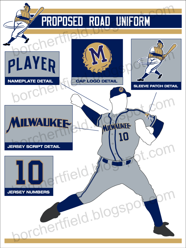
The details, in no particular order:
Sleeve patch
For me, it all starts with bringing back the one, the original, the Beer Barrel Man. Symbol of Milwaukee baseball since at least 1901. Time he finally made the sleeves.Wordmarks
The script font on the home jersey is Saloonkeeper, based on the script used by Leinenkugel's. It's surprisingly similar to the script used by the Brewers in the 1940s. The road wordmark is based on a 1930s Pabst Blue Ribbon label - I'm terribly fond of that one.Colors
The color scheme utilizes the blue and gold influenced by the current colors (the only thing I really flat-out love about the current scheme). I've moved the home uniform to a light cream to reflect Milwaukee's nickname as The Cream City, as well as the various historical baseball teams known as the "Creams" and "Cream Citys".
Accent Striping
I included the shoulder piping not only because it has an historical precedent, but would also create a pattern currently unique in the majors. Another way to instantly identify the team. The Brewers used a similar thick piping from 1996-1999, and it looked great.Number font
The numbers are what I call a simple square block. Again, they could be as easily identifiable as the San Francisco Giants' numbers are, without either drawing too much attention or sacrificing legibility. FWIW, I'm basing these on a number font worn by the Packers in the 1940s.The cap logo
Well, I've always wanted to use a bottlecap in a Brewers concept. And the block "M" on the bottlecap clearly references the Milwaukee Braves and the American Association club.... okay, maybe I'm officially overthinking this one.

So there you go. Heavily influenced by the past while being (I hope) distinctive and modern enough to work today.

I really like and appreciate what you're doing here. I've been working on something similar for the past year and a half on my blog - but it's for the Nationl League team Detroit Wolverines that folded right after their NL Pennet win in 1887. My project is more along the lines of - if the club continued, what might all their incarnations be -both good and bad. my goal is to get back to a place where the modern reflects the past, much like your designs reflect that sentiment.
ReplyDelete