
Happy Holidays to you and yours!
Thank you again for reading, and for bearing with us in this rather trying 2017. Now that the Journal Sentinel archive is back online, we're looking forward to a very productive New Year.

THE STORY BEHIND THIS 1953 BREWERS TICKETOutstanding.
MATTHEW PRIGGE
NOVEMBER 1, 2017
LAST UPDATED ON NOVEMBER 3, 2017
County Stadium helped to make Milwaukee Big League in 1953, but it nearly opened with a minor league tenant.
The Brewers had been Milwaukee’s home team for over a half-century when the Boston Braves relocated to the city, bringing Major League Baseball to Wisconsin for the first time since 1901. Those Brewers were minor leaguers, members of the American Association, and played their home games at Borchert Field on the city’s north side.
By 1950, with a number of east coast Major League clubs struggling, Milwaukee – which always gave the Brewers ample support – was seen as a potential destination for a team in need of a new hometown. That fall, ground was broken on Milwaukee County Stadium, a publicly-financed modern ballpark that, it was hoped, would lure a Major League baseball team and (just maybe) the NFL’s Packers out of Green Bay.
In the meantime, the new stadium secured a tenant in the minor league Brewers. After a number of construction delays, an opening date of July 24, 1952 was announced. The Brewers would have the privilege of playing in the minor’s most luxurious park until a Major League tenant was secured. Unfortunately, more delays pushed the opener back to April, 1953 and it now seemed that a big league team could be secured for the ballpark’s debut.
While the city chased the St. Louis Browns, who were in dire need of a new hometown, the Brewers prepared for an opener at the new stadium. Printed materials from the end of the 1952 season boasted of the new park even though the stadium’s backers were aghast at the idea of the park opening as the home of the Brewers. Over the winter, the Boston Braves, who owned the Brewers, opposed a Browns move to Milwaukee on the grounds that Milwaukee was too valuable a territory to surrender without a comparable market to which his Brewers could move.
Of course, no city could offer a brand new stadium for a minor league team, and the Braves’ objections were mostly to delay any action until they could orchestrate their own shift to Milwaukee. Meanwhile, the Brewers were forced to act as if they would actually open the season at County Stadium. Arrangements were made and tickets were printed but, just weeks before the season was set to open, the Braves move was approved and the Brewers were sent packing, relocated to Toledo to operate as the Mudhens.
This ticket, one of a few known of its kind, could have been exchanged for a ticket to the Braves opener at County Stadium (with an extra 75 cents to make up the difference in price) and would have allowed the bearer to see a great game in which the brand-new Milwaukee Braves topped the St. Louis Cardinals 3-2 on a walk-off homer by Bill Bruton.
"1953 MILWAUKEE BREWERS TICKET FOR GAME NEVER PLAYED AS BOSTON BRAVES MOVED INTO MILWAUKEE THAT YEAR"


MILWAUKEE BREWERS GROUNDS CREW JACKETCan't wait to see this.
$125.00$99.00
American Association
History: The American Association Brewers started play in 1903, with the colorfully-named Jiggs Donahue leading the league in hitting. The club maintained a rabid fan base for half a century, until they were supplanted by the Boston Braves, who became the first MLB franchise in modern history to relocate. The Brewers name was revived in 1970 when the bankrupt Seattle Pilots moved to the Cream City.
ITEM: MILWJ
PRODUCT DETAILS
Please allow 3 - 4 weeks for production
- Lightweight cotton blend water resistant fabric
- Heavy duty brass zipper
- Slash pockets in front
- Felt chest emblem & felt letters on back
- Pencil pocket on left sleeve
- Cellphone pocket inner-left chest
- Made in the USA


 It wasn't until very recently that I realized that the picture was actually of manager Charlie Grimm. The original image comes from this 1941 wire photo:
GRIMM TAKES OVER AS MANAGER OF BREWERS
Milwaukee, Wis.: Charley Grimm, former manager of the Chicago Cubs, coaching back of first-base in night game between Minneapolis and Milwaukee Brewers, after he had taken over job as manager of the Brewers. The Brewers lost the game, 8-4, the first since William Veeck and Grimm joined the Brewers with several of the Cub players.
 The Beer Barrel Man gets another issue, this time on an unstructured cap by '47 Brand (which used to be known as Twins Enterprise and Twins 47, and is still the best cap manufacturer out there).
 Even the little logo tag on the back is period-appropriate, in this case a gold 1970s block "M".
  This is now my absolute favorite cap: perfect headwear for a run through the postseason.
This marked a sea change for the Brewers, the first time their working-man nickname was featured on the jerseys.Mickey Heath Tries On the New Brewer Uniform
The new baseball uniforms for the Brewers arrived last week and Mickey Heath (left), back with the club as coach, tried on the home suit. He and Rudy Schaffer, club secretary, are holding up a shirt of the road uniform. Home uniforms are of white jersey and the road suits are dark blue. At present the most important date on the Brewers' calendar is the one shown in the picture—Apr. 16, opening day.
 To my knowledge, this jacket (and a wool late-season version with tan leather sleeves) was the first and only appearance of Owgust, the beer barrel man, on the club's gear.

 And, of course, we have our own exemplar of a 1943 road jersey from Paul Tenpenny's collection:
 I can't help but wonder, though. The complete absence of blue on those 1943 gray road uniforms has long puzzled me. Blue defined the Brews for their entire existence, except for this one blip. Red lettering with white outlines, just like Heath's 1942 blue roads.
  This logo will also be featured as a sleeve patch on all jerseys (including the long-rumored, not to mention long-overdue, road alternate which proudly reads "Milwaukee" across the chest).
 Wonderful to see the BBM get some more of his due, even obliquely. Now if we can just get him on the sleeves....
 There, between beermaking images, is a scene from Borchert Field.

 Okay. That's the good. The bad is that, even allowing for artistic license, the Brews never wore anything like that in the Awkward Confines of the Orchard. That's the gray road uniform.
 The cap shown there is from 1947-1952, the period in which the Boston Braves owned the team (and which would be subsequently adopted by the National League franchise when they moved west to the Cream City). The jersey, not so much.
 By 1952, the Brewers' last year of existence, their uniforms had evolved to almost a perfect match of those of the Braves:
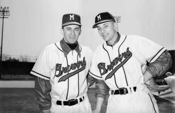 The piping is now definitely red/navy/red. Note the style of "B" and the Greek "e" on the script, which originated in the Boston Braves wordmark (even the "w" is just two Braves' "v"s run together).
 There on the scoreboard, right below Milt Mason (the original Bernie Brewer) in his perch, is a recolored Beer Barrel Man:
 Not exactly true to the period, but very cool. Further justification for putting him on the team's sleeve. As if we needed any more.
 This went unnoticed, because the page on the Brewers' site said only:
The Barrel Man was used less after the 1978 season. Bernie Brewer gets top billing now, but Barrel Man still lurks at Miller Park.I hadn't heard about them actually hitting Miller Park shelves until today.
"We have a good amount of Barrel Man products on order, and it should be in very soon," said Brewers spokesman Tyler Barnes. They include shirts, caps and plush Barrel Man toys.
 It's an interesting assortment. Looking left to right, starting with the gold t-shirt:
 This "Welcome Brewers" logo, while made to look as though from the 1970 inaugural season, was actually created in the 1990s by MLB Properties for inclusion in the Cooperstown Collection line.
 MLB worked up a whole bunch of throwback logos for the various clubs. The same logo appears on the shot and pint glasses.
I like the 1970s Beer Barrel Man cap, even if I'm not wild about the gold bill. And the stuffed Men are pretty cute.
The second cap is definitely the same c. 1970 water transfer Flex-Cote decal we've seen before. The blue t-shirt is a women's cut, and it features a variant of the Beer Barrel Man which was featured on the cover of the team's 1975 Media Guide (hence the uniform number).
 For what it's worth, the caps seem to be the only items currently available in the Brewers' online shop. But that can change - I know the gold t-shirt was up there earlier in the season.
So, on the whole, my reaction? Something of a mixed bag. I wish there was more focus on the Beer Barrel Man himself, aside from the "Welcome Brewers" dressing. But I'm so glad the Brewers are finally recognizing this long-neglected chapter in their history (and Milwaukee baseball history in general), I don't really mind.
Now it's our turn. If you're also glad that he's getting a shout out in the land of the Ball and Glove, let the Brewers know. Perhaps even buy an item or two. That might be the only way we can get the National League outfit to recognize the legacy of the American Association Brewers in any form.

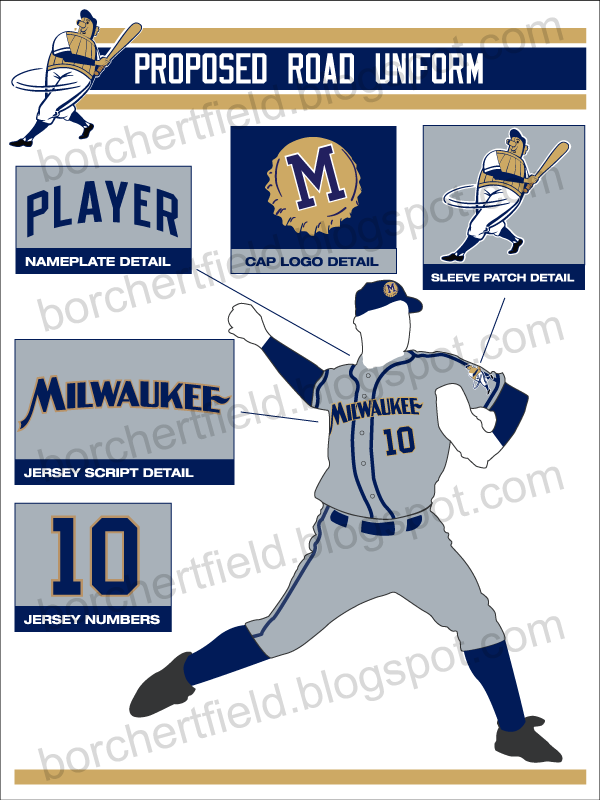
The details, in no particular order:
Sleeve patch
For me, it all starts with bringing back the one, the original, the Beer Barrel Man. Symbol of Milwaukee baseball since at least 1901. Time he finally made the sleeves.Wordmarks
The script font on the home jersey is Saloonkeeper, based on the script used by Leinenkugel's. It's surprisingly similar to the script used by the Brewers in the 1940s. The road wordmark is based on a 1930s Pabst Blue Ribbon label - I'm terribly fond of that one.Colors
The color scheme utilizes the blue and gold influenced by the current colors (the only thing I really flat-out love about the current scheme). I've moved the home uniform to a light cream to reflect Milwaukee's nickname as The Cream City, as well as the various historical baseball teams known as the "Creams" and "Cream Citys".
Accent Striping
I included the shoulder piping not only because it has an historical precedent, but would also create a pattern currently unique in the majors. Another way to instantly identify the team. The Brewers used a similar thick piping from 1996-1999, and it looked great.Number font
The numbers are what I call a simple square block. Again, they could be as easily identifiable as the San Francisco Giants' numbers are, without either drawing too much attention or sacrificing legibility. FWIW, I'm basing these on a number font worn by the Packers in the 1940s.The cap logo
Well, I've always wanted to use a bottlecap in a Brewers concept. And the block "M" on the bottlecap clearly references the Milwaukee Braves and the American Association club.... okay, maybe I'm officially overthinking this one.
So there you go. Heavily influenced by the past while being (I hope) distinctive and modern enough to work today.
 And just for good measure we can put this wrong to right:
 Come on, Mr. Attanasio. It's time.
UPDATE 04/13/09: Paul suggested that this might be a more realistic goal: Even that would be a step in the right direction. The deadline for 2010 season changes is May 31st of this year, so we need to spread the word soon. Time to step up to the plate:

 |  |  |


